|
1 |
|
|---|---|
| Posted by | Nectarine Base (Gold Countershaded) |
 Lithium (#4297) View Forum Posts  Posted on 2017-08-14 19:05:02 |
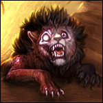
It doesn't seem like we have a more reddish-countershaded gold base. Also I just really love the color of nectarines so I thought I'd play with it and, uh, here's Nectarine? First time trying a base here so totally open to constructive criticism. For Reference Edit: With feedback suggested below by JackNOTDaniels (#43365) and The Cackling Lummox (#275) (thank you!) - two new versions with better blending. These are identical except Version 2 has a stronger red, Version 3 is lighter on the red. Version 2 (darker red):   Version 3 (softer red):   Version One: Lined / Lineless |
 Report
|
{🌌} Elementalist {🌌} (#56591) 
Heavenly View Forum Posts Posted on 2017-08-16 12:55:35 |

|
JackNOTDaniels (#43365)
Majestic View Forum Posts Posted on 2017-08-16 12:57:50 |
I love it. may i suggest the top red be more 'blended' with the rest of the colors? looks a bit too....ah....'sharp?' hope i make sense?  0 players like this post! Like? 0 players like this post! Like? |

The Cackling Lummox (#275)

Devastator View Forum Posts Posted on 2017-08-16 13:03:49 |
Positively lovely! Definitely support! I really adore the color combo here, and the form is rather nice as well! One suggestion though- I feel like the coverage of light on the face really doesn't match up with the rest of the light coverage througout the body. Either soften the gradiation between the midtones and light on the muzzle or pull the light back a drop so it matches where the fleshy pad on the lips end. (So it stays between the "y" shape touches the lips and the end of the muzzle. ) ALTERNATELY- Pull the light down a bit where it touches the cheeks and then drag it out to fall along the side burns a bit. Sorry if this is hard to understand, I had trouble describing it haha. I'll try and find the files to make a mock-up of that I mean. 0 players like this post! Like? |

|
The Cackling Lummox (#275)
Devastator View Forum Posts Posted on 2017-08-16 15:57:06 |
Slight edits to the lightest:   Edits to light + softening color transition a bit: suggested by Jack(#43365)   0 players like this post! Like? 0 players like this post! Like? |
|
Lithium (#4297)
View Forum Posts Posted on 2017-08-16 16:05:24 |
Ah I love the changes & suggestions here so far, thank you! I'll also see about a possible mockup of my own once I can sit down and fuss with it. 0 players like this post! Like? |
|
The Cackling Lummox (#275)
Devastator View Forum Posts Posted on 2017-08-16 16:12:04 |
Awesome! I'm glad we could help! I really do adore this suggestion<3 0 players like this post! Like? |
|
Lithium (#4297)
View Forum Posts Posted on 2017-08-21 19:32:33 |
Stupid wrist tendonitis. :( ANYWAY - Two new revisions posted in the OP - version two is darker red than version 3, but they're otherwise identical. Went for better blending on the red and the softer tones, focusing the softer tones in a better placement on the body as well. 0 players like this post! Like? |
|
Fading Angel (G2 2k) [Frozen] (#81854) Holy View Forum Posts Posted on 2017-08-21 22:43:24 |
I prefer 3 over 2.. The lighter coloring makes it blend better. I love it <3 0 players like this post! Like? |

|
Sisi (#23003)
King of the Jungle View Forum Posts Posted on 2017-08-21 22:46:36 |

|
Dazai (#110927)
King of the Jungle View Forum Posts Posted on 2017-09-10 14:26:07 |

|
𐂂 Neon Genesis 𐂂 (#164933) Maneater View Forum Posts Posted on 2023-09-07 17:32:46 |
1 |
|---|
Memory Used: 630.73 KB - Queries: 2 - Query Time: 0.00065 - Total Time: 0.00445s