|
1 |
|
|---|---|
| Posted by | Azurite Base |
 Luxaeus [hiatus] (#80752) View Forum Posts  Posted on 2019-01-04 13:06:43 |
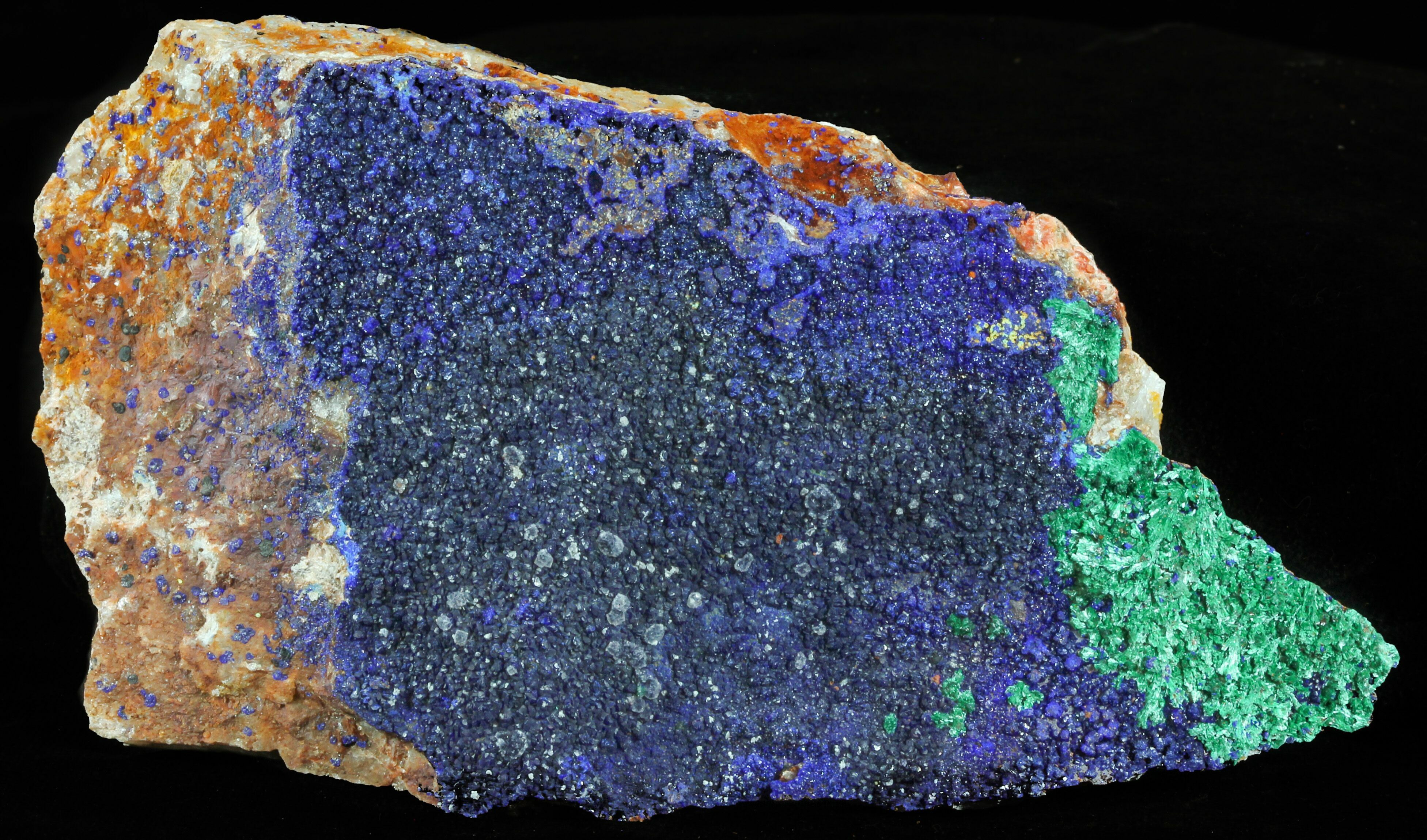
So this is the first base I've ever done on my own, coloring wise. and tbh im not even that artsy when it comes to art programs. I wanted to make a nice, deep blue base therefore I looked for stones. Azurite was one of them that caught my eye the most. |
|
Meteorstar (Main) (#157518)
Wicked View Forum Posts  Posted on 2019-01-04 13:11:49 |
Try to find a blue that has no green in it, the green's too bright. try lapis lazuli  0 players like this post! Like? 0 players like this post! Like? |
|
🅱️oneless (#123346)
View Forum Posts  Posted on 2019-01-04 13:25:24 |
I'd soften up that green and grab colors directly from the image of the gemstone (I don't see the greens you used for the base anywhere in the gem itself, for example). Then, I'd have the colors more intermingled and together! I really like the gemstone  0 players like this post! Like? 0 players like this post! Like? |
|
Ninque [HIATUS-ish] (#106221)
Dreamboat of Ladies View Forum Posts  Posted on 2019-01-05 13:27:15 |
The colors are too strong and really hurt my eyes. You should've used these pastel colors shown on gem image you posted.  0 players like this post! Like? 0 players like this post! Like? |
|
Telly| x3 Rose, daedal, ice (#51014) 
Amazing View Forum Posts  Posted on 2019-01-05 13:32:12 |
This base is overly saturated, It needs to be dulled down quite a bit and the blending between the green and blue isnt really amazing, its obvious that you made lines and just used a blending tool in certain parts and not at all in others. I like the gem idea, just not the base proposed along with it  0 players like this post! Like? 0 players like this post! Like? |
|
Luxaeus [hiatus] (#80752)
View Forum Posts  Posted on 2019-01-05 21:41:34 |
Made a revised version using colors from that image as well as learning a new blending technique (since Im v new at art, i thought a lot of artists use blur or smth similar.). Thoughts?  I want to add the orange/brown in there but not sure how! But I'm going to end up making a seperate base altogether that has brown/tan/white tones to it, just trying to figure out which colors to do  0 players like this post! Like? 0 players like this post! Like?Edited on 05/01/19 @ 21:42:40 by Sin Celery (Ace) (#80752) |
|
Telly| x3 Rose, daedal, ice (#51014) 
Amazing View Forum Posts  Posted on 2019-01-05 21:43:21 |
its still too bright :/ I would stuck to more natural bases if youre new to art just so you can get a handle on designing and what looks right.  0 players like this post! Like? 0 players like this post! Like? |
|
Luxaeus [hiatus] (#80752)
View Forum Posts  Posted on 2019-01-05 21:44:47 |
That seems fair. Thank you <3 I'll try some other ones then!  0 players like this post! Like? 0 players like this post! Like?Edited on 05/01/19 @ 21:44:55 by Sin Celery (Ace) (#80752) |
|
ShadowDawn2 (#48239)
Deathlord of the Jungle View Forum Posts  Posted on 2019-01-05 22:04:20 |
i hope it's okay i made a blue base with colours picked from the image it's probably darker than what you were going for but i loved the idea of a blue base ^^ https://sta.sh/0dz5x8umgkq i tried to add some green into this version https://sta.sh/01scfpj3zmaf i'm not sure how to add images  0 players like this post! Like? 0 players like this post! Like? |
|
Luxaeus [hiatus] (#80752)
View Forum Posts  Posted on 2019-01-05 22:06:03 |
aa i really like those shadow! mind if I add them to the main post, crediting you of course?  0 players like this post! Like? 0 players like this post! Like? |
|
ShadowDawn2 (#48239)
Deathlord of the Jungle View Forum Posts  Posted on 2019-01-05 22:07:40 |
|
ShadowDawn2 (#48239)
Deathlord of the Jungle View Forum Posts  Posted on 2019-01-14 02:04:29 |
i got curious what the base would look like on the tigon XD this is the normal version https://sta.sh/0ykz9oe7y2c this is with the other colours brighter https://sta.sh/02usqkmt89l and this is version 2 with the markings blended more https://sta.sh/0vc3uzau6ws  0 players like this post! Like? 0 players like this post! Like? |
1 |
|---|
 Report


