|
|
|
|---|---|
| Posted by | supernal is wacked up |
 coolio 🍄┃haze (#149374) View Forum Posts  Posted on 2023-09-22 19:28:30 |
this started because i noticed some pretty big inconsistences between supernal neutral and kind pose. and then i realized there were inconsistencies with snarky too. and evil. and basically every single pose for supernal is entirely different. as the title says, supernal is wacked up. so wacked, in fact, i'm not entirely sure what supernal base is supposed to look like anymore. so i'm going to walk through every pose i found problems with and we're going to examine every detail of supernal. fun. to start, this is default supernal: 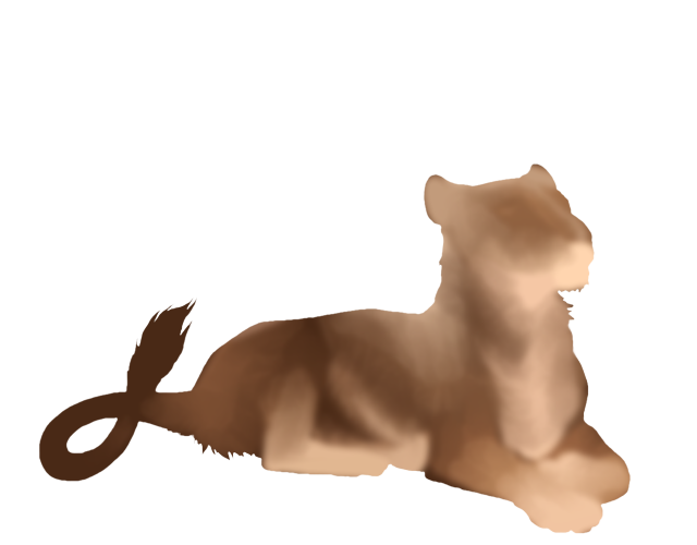 this is like, really good stuff. i am going to assume that this is meant to be what supernal looks like. visible brushstrokes, a notable, distinct light patch along the shoulders, and the stripe along the belly has a kind of "feathering" 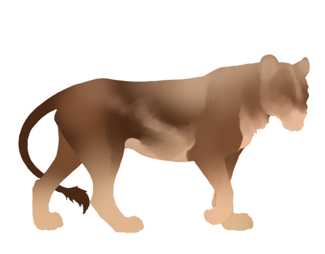 neutral's issues seem to be from the fact that it is so much more horribly blended. while default is done in the same brush stroke style, neutral seems to alternate between that style and airbrushing. the biggest issue neutral faces is that back leg. it is seemingly unblended, creating a harsh line between the leg gradient and the strokes of dark brown 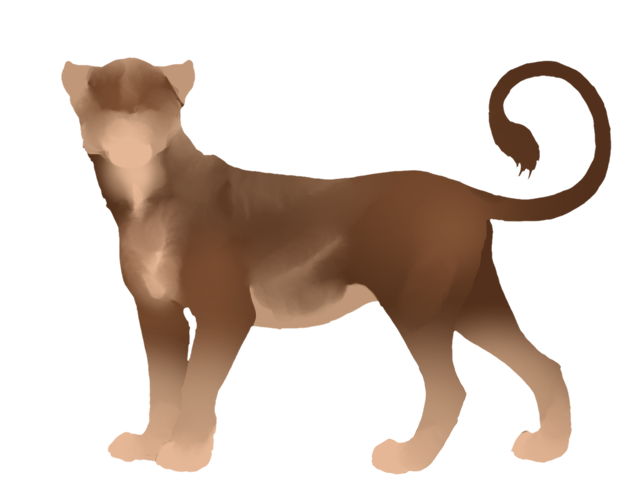 can you see the issue with kind already? remember when i mentioned that distinct light patch along the shoulders. yeah, she's not here is she. while most of what i'm going to point out in this post are "nit picks" only noticable from closely examining lineless files, the complete lack of the lightness on the shoulders was jarring to me just from playing in wardrobe. its my main issue with supernal 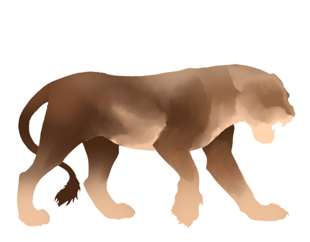 here's evil. evil is actually really good. i like evil. be more like evil. what's fun about evil? look at the line that goes from behind the front leg up until the back leg. see how thick it is? look back at it on kind. it's incredibly thin there 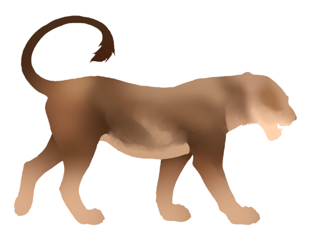 snarky is intensely airbrushed in comparison to the other pose, much less distinct brushwork. and look at her line. now its totally disconnected from the belly line and just floating? odd 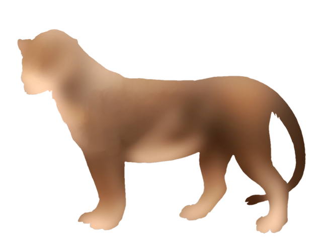 lastly because i think you get the idea. good ol default male. holy airbrush. i can see like two brush strokes on this bad boy and that is it. there's not even really that light patch anymore because his whole head is so light. the feathering on the belly strike? completely gone. oh, and color from his back leg is leaking onto his tail. poor guy  17 players like this post! Like? 17 players like this post! Like? Edited on 12/04/24 @ 13:52:57 by coolio 🍄┃maziwa (#149374) |
No replies have been posted yet.
Memory Used: 540.85 KB - Queries: 2 - Query Time: 0.00067 - Total Time: 0.00366s
 Report