|
1 |
|
|---|---|
| Posted by | Zaffar base 💙💕 |
 xFinch (#236930) View Forum Posts  Posted on 2024-12-14 16:29:32 |
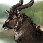
I made this with only a few colors, complimentary colors, and less patterns based on suggestions 😁  |
 Report
tits (#245975)

Punk View Forum Posts Posted on 2024-12-14 16:32:52 |
No support, the colors need to be blended out more and they clash with eachother  1 player likes this post! Like? 1 player likes this post! Like? |
|
🦚 Sakasu 🦚 G1 Ukame Ennedi (#256269) Frivolous View Forum Posts Posted on 2024-12-14 16:44:26 |
There's no need for the red splotch on the side and There's no blending between the colours. Really look at lioden's existing bases to see their general structure. While you were told to try complementary colours, you can't just slap them together with no real direction and have it work. Critically look at your own work and compare it to lioden bases and ask yourself if it fits. 1 player likes this post! Like? |

|
Tron (#42140)
Amiable View Forum Posts Posted on 2024-12-14 16:46:32 |
They definitely need blending. It's a cool concept, but needs some execution tweaking! I definitely recommend Autodesk Sketchbook, as it has built-in blenders and is free (and can be downloaded on most computers or tablets like iPad!). It'd make things easier, though as there's brushes that blend by default and such as well.  0 players like this post! Like? 0 players like this post! Like? |
|
FallenSparrow𓅩☀ (wuh luh wuh) (#236025) View Forum Posts Posted on 2024-12-14 16:55:28 |
|
♡꧁ 𝑇ℎ𝑒 𝐷𝑒𝑎𝑙𝑒 𝑟 ꧂♡ (#417178) Aztec Knight View Forum Posts Posted on 2024-12-14 16:55:39 |
without the red, it'd look very well, with better blending and whitening/softening the colors would make it look very nice! unfortunatly its a no support for me right now 0 players like this post! Like?Edited on 15/12/24 @ 12:49:09 by ♡꧁ 𝑇ℎ𝑒 𝐷𝑒𝑎𝑙𝑒𝑟 ꧂♡ (#417178) |

|
⛄❄️Celeana🇹 🇳🇵🇸 (#374387) Impeccable View Forum Posts Posted on 2024-12-15 12:48:03 |
no support. As everyone else has said: 1) red is unecessary 2) Blend more, ALOT more xD 3) the purple and such look randomly placed.... maybe be more intentional with it. 0 players like this post! Like? |

1 |
|---|
Memory Used: 629.16 KB - Queries: 2 - Query Time: 0.00064 - Total Time: 0.00422s