|
1 |
|
|---|---|
| Posted by | Equine greyscale Finished! |
|
Konik (main) (#15479) Mean View Forum Posts  Posted on 2015-01-20 01:48:50 |
 0 players like this post! Like? 0 players like this post! Like? Edited on 24/01/15 by i3nici (main) (#15479) |
|
dragon (#48699)
Notable Lion View Forum Posts  Posted on 2015-01-20 02:39:36 |
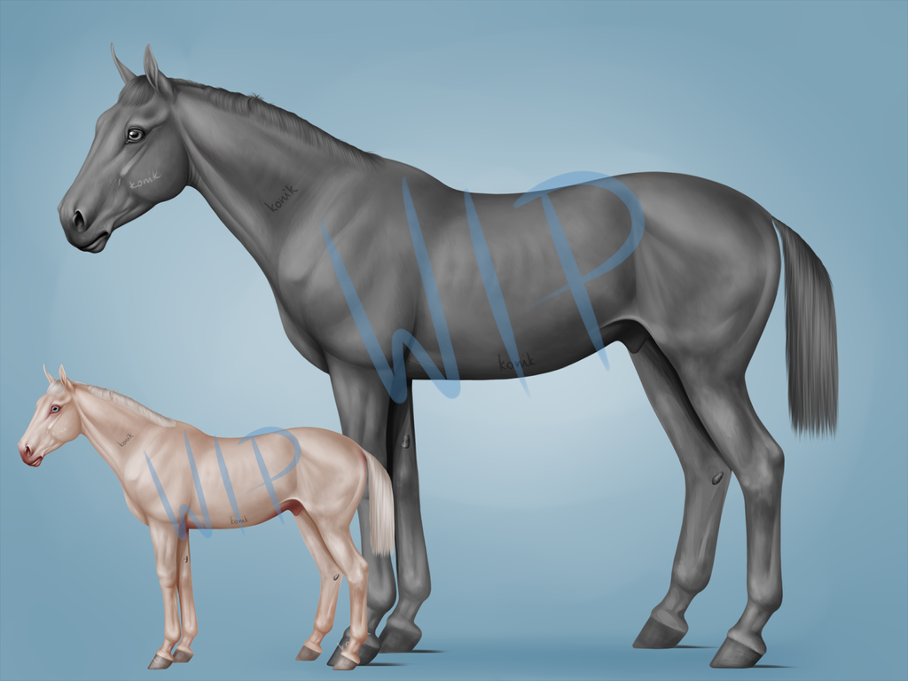
This is gorgeous! The anatomy is really good, and I really don't see anything wrong with it.  0 players like this post! Like? 0 players like this post! Like? |
|
Konik (main) (#15479)
Mean View Forum Posts  Posted on 2015-01-20 02:46:19 |
Thank You! :3 Don't You think there's something wrong with the shoulder? I can't quite figure it out...  0 players like this post! Like? 0 players like this post! Like? |
|
mau | g1 6k frontal 3ros cel (#32469) 
Impeccable View Forum Posts  Posted on 2015-01-20 02:52:17 |
There are a couple minor things I see that could be tweaked for anatomy, but did you have any breed in mind, so I don't guide you astray? ^^ As a general observation, the neck is a bit to thick for the shoulder, horses typically have a more pronounced 'bump' in that area c: The butt is also a tad too pronounced compared to the rest of the leg - in a fairly relaxed position, that transition should be softer and flatter, though it does depend on the breed ^^ I'm not sure if it's because of the overlay of the smaller horse making an illusion, but the legs on the horses right side/the one away from us, the hooves don't quite look aligned on an even plane c: Otherwise, this looks gorgeous, especially for something without reference c: I do highly recommend changing the greyscale to a 'brownscale', they tend to be easier to finalize shading and work in other colors and bases with, though to each their own in that regard ^^  0 players like this post! Like? 0 players like this post! Like? |
|
Konik (main) (#15479)
Mean View Forum Posts  Posted on 2015-01-20 03:35:56 |
Fak me - I've had a long comment and I accidentally refreshed the page. -_-" Thank You Maulise! Anyway, I was going for a general warmblood type (they have thicker necks, don't they?) and a younger horse. Not fully grown animals tend to be a tad disproportionate, so that was my intention (probably overdone it causing the rear to be too big). Well, if the horse doesn't look juvenile, do You have any suggestions on that? I won't fix the neck/withers transition, however the rear/hind leg does seem off now that You mentioned it. :) The shoulder alone bugs me as well... As for the further away legs - they are not aligned indeed and on purpose. The gap between hind legs is bigger than that between the front legs, so they are more apart. Hope it makes sense? If not, and You still think it looks weird, I'll fix that too. :) I'm quite aware as to colouring greyscales. Working with grey tones excludes saturation problems, so it's easier. Once the whole thing is done I'll make it brown and work with that on the colouring. Thanks for the tip anyway, although I knew it. :D  0 players like this post! Like? 0 players like this post! Like? |
|
mau | g1 6k frontal 3ros cel (#32469) 
Impeccable View Forum Posts  Posted on 2015-01-20 03:43:34 |
Damn, I hate when I do that x-x Ahhh, sorry, I missed that it was a younger horse! Yeah, they do tend to be all lanky and awkward, haha. Just looked up a few reference photos, and yeah, you're right! Been a while since I've worked with horse art, so that actually looks about right! ^^ I can't quite properly articulate what you could edit about the body to make the horse look younger, I think it's something about the proportions. Yearlings tend to have large ears, and a smaller, more careful head in proportion to the body, I think that might be it? The legs look about right to me in length. For the shoulder, it could be the slope at the end of it that looks off to you? c: In yearlings, the shoulder it less rounded, and more like a plateau, if that makes sense, there's more of an 'angle' there.  Sorry it's a smaller photo, but it shows what I mean about the shoulder pretty well, it might help you a bit with tweaking proportions, as well ^u^ EDIT: Looking at them on the same page, yeah, it seems like it's something about the head/base of the neck that makes your greyscale look older than you had in mind :3 There's a more dramatic difference between the start of the neck and the end of it, which is the big thing, though I'm not totally sure.  0 players like this post! Like? 0 players like this post! Like?Edited on 20/01/15 by Maulise | Cozy Floof (#32469) |
|
Bridge [G1 Ebony Royal] (#14541) 
Sweetheart View Forum Posts  Posted on 2015-01-20 03:46:51 |
This is gorgeous, I'd love to colour these for tags if you're looking to collab. ^-^ Well, here's what I see, from a conformation perspective. The neck actually ties in great so I'd leave that alone. The shoulder is SUPER slopey though, perhaps change the angle just slightly to make the shoulder just a tiny bit more perpendicular to the ground. Then again, I'd wait to do that until you make other changes to do that, leave it for last, as it may look fine with other changes. He's a little sickle hocked. When you drop a line from the very widest part of the butt, it should line up directly with the cannon bone. I understand that his hoof is placed a little further back, but because of that and the fact that his cannon bone is currently at exactly 90' angle to the ground, when the foot comes forward it will make that cannon bone change angle, thus making him sickle hocked. That's the biggest thing I see, and sickle hocked horses can look REALLY wonky in the hind end. Only other thing, and this may be intentional b/c he's a WB, but he's a little uphill. His withers are higher than his butt. Ideally, you'd want the highest point of the withers and the highest point of the but to be on the same horizontal line. BUT some jumpers like there horses to be uphill. Makes take-off easier. Sorry for my novel. =|  0 players like this post! Like? 0 players like this post! Like? |
|
Konik (main) (#15479)
Mean View Forum Posts  Posted on 2015-01-20 05:48:16 |
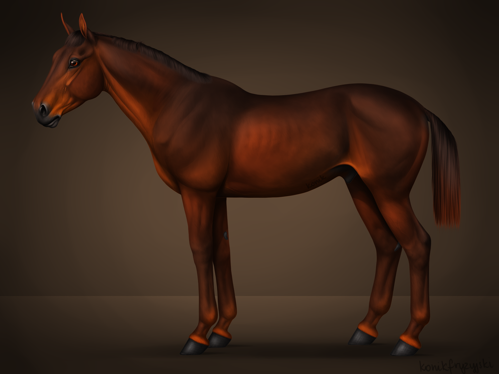
Thank You Valery! :) I've looked up the correct hocks positions to understand it more and hopefully the legs are fixed. :) So here's what I've done : - made the ears slightly longer and tried to do something with the face, but I can't make it more baby like. :/ - thinner neck would indeed make the horse look more juvenile but it'd also make it look too disproportionate, so I decided to leave the neck alone. - adjusted the shoulder angle and the whole front leg as well. - made the bum a tad smaller and also adjusted hind legs. - tried fixing the withers to butt heights, but I decided I quite like him (well, her for now) being uphill. Well I guess it won't be either a yearling nor an adult horse. Something mutated in between then. :D Here's how it looks now, I've added the lines for the legs to see if everything lines up.  You guys are being so helpful, I'm really greatful. :3 Anything else You see there?  0 players like this post! Like? 0 players like this post! Like? |
|
Bridge [G1 Ebony Royal] (#14541) 
Sweetheart View Forum Posts  Posted on 2015-01-20 06:01:01 |
It looks great!! =) I like uphill too, like I said, it makes take-off for jumping easier. ^_^ Maybe, to give it that youngish look, you could try making the eye just a tiny bit bigger? Young animals usually have big eyes. idk. You could also try making the jaw/chin area just a little thinner? Young horses tend to not be so developed in the face. But this definitely looks great!  0 players like this post! Like? 0 players like this post! Like? |
|
Konik (main) (#15479)
Mean View Forum Posts  Posted on 2015-01-20 06:08:01 |
Thanks again Valery! :) I'll fiddle with the head a bit more when I'm done with everything else. I'm not a big fan of jumping, but I remember a pony I used to practice jumping for a qualification thing (it's called a bronze riding badge of polish equestrian association, no idea if there are other countries who do that) had a rather low set bum and sticking out withers. It was a weird thing, looked like a mini akhal teke, haha. :D He was very comfy and everything...  0 players like this post! Like? 0 players like this post! Like?Edited on 20/01/15 by i3nici (main) (#15479) |
|
Castelau Canaïde (#16175) Bone Collector View Forum Posts  Posted on 2015-01-20 06:26:38 |
Hum. No doubts about it, this is a fine piece of work. My only issue with it is that, to my eye, it looks very static/frozen, if that makes any sense for a standing horse. All the yearlings/youngsters I have known are always in motion or showing their feelings/emotions (These are of course French anglo-arabs and the oversized light warmbloods the French are mad for though). It could be something as simple as the mane and tail in the last image being a touch too straight or the eye and nose too calm, but I would personally prefer to see more movement or emotion in the piece. Otherwise, beautiful!  0 players like this post! Like? 0 players like this post! Like? |
|
Konik (side) (#16059)
Scourge of Lions View Forum Posts  Posted on 2015-01-21 18:56:48 |
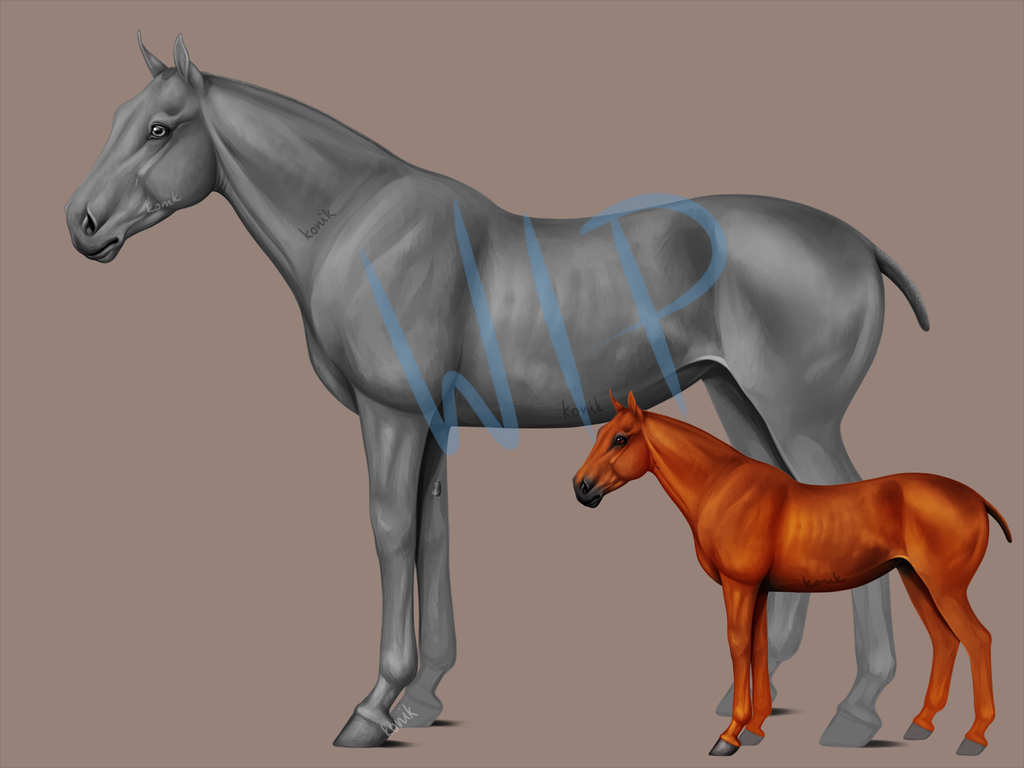
Natasha - thank You! While it's a perfectly valid point and I'll certainly keep it in mind for the future, I was kind of going for the calm, a little scared look from the beginning and now I'd have to change the entire concept. :/ He turns out to look more and more like and adult horse (at least that's what I can see), so I'll just keep him as that. :D Here's the last WIP. Tried another colour to see how it's working out. :) The head, neck, shoulder, front leg, barrel and hair is all done. (I'll probably end up tweaking some details later anyway). I made the eye a bit larger and fixed the eye area as well as the nose.   0 players like this post! Like? 0 players like this post! Like? |
|
Bridge [G1 Ebony Royal] (#14541) 
Sweetheart View Forum Posts  Posted on 2015-01-22 03:35:38 |
1 |
|---|
 Report

 *Drag and drop to a new tab for full size.*

