|
|
|
|---|---|
| Posted by | Citrabun (200+Supporters!) |
 NOTN (#11922) 
View Forum Posts  Posted on 2018-03-01 13:02:29 |
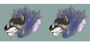
So I was messing around with some colors and I fell in love with how this Gold and brown mixed together. Its only be Primals right now as I haven't done the other mutations and regular lions. (but will come soon I promise!) and I got the Idea from looking at the Citrine crystals while eating a honey bun >>;; If anyone is interested to know the hex's used. #f7ce58 for the gold #4b1d00 for the Cinnabun brown #f2eae6 for the white markings #e61e11 #fac507 #fefe0a #fa8b7e for the eyes But right now this is what I came up with.  Above is the original edit just thrown together below is the fixed up version to better see how the 'markings' fit with the 'base' and 'eye color'. let me know what you think with the updated fashions for this Idea! Base without Markings and eye color.  Marking sets without base / eye color.  Eyes without base/markings.  Everything put together!  Other stuff to help Support?!Azurite Eyes! CitraBun! Rubber Ducky Decor! Friend/Ally Search in profiles! Honey Bush base! Fushia Flower Decor! |
|
Ashleigh (#108719)
Demonic View Forum Posts  Posted on 2018-03-01 13:05:56 |
It's very pretty, but I don't think I like the idea of a primal-only base/eyes. Even Kimanjano and Mottled Rosette, only available on leopons, passes to normal lions. It's fine if there's only a primal markup for it, but I don't like the idea of it ONLY being available for primals. It's absolutely gorgeous, though, so I'm still going to support! :D  0 players like this post! Like? 0 players like this post! Like? |
NOTN (#11922)

View Forum Posts  Posted on 2018-03-01 13:08:18 |
OH I'm sorry <3 I meant like. I only made a design ON primals ;A; not just for them. My bad, sometimes my fingers function faster than my brain. I shall edit that so there isn't a lack of confusion <3  0 players like this post! Like? 0 players like this post! Like? |
|
Ashleigh (#108719)
Demonic View Forum Posts  Posted on 2018-03-01 13:09:44 |
NOTN (#11922)

View Forum Posts  Posted on 2018-03-01 13:10:53 |
welcome! I just only had the Primal PSD's so xD  I really need to get the other PSD's I really need to get the other PSD's 0 players like this post! Like? 0 players like this post! Like? |
|
Ashleigh (#108719)
Demonic View Forum Posts  Posted on 2018-03-01 13:12:05 |
You can google "Lioden base transparency" to find most of them—that's what I did!  0 players like this post! Like? 0 players like this post! Like? |
|
Thalath {Offline} (#41669)
Wanderer View Forum Posts  Posted on 2018-03-01 13:16:17 |
It's... wow. This looks really cool. It's super bright and could possibly benefit from being toned down JUST slightly, but I love the idea of it.  0 players like this post! Like? 0 players like this post! Like? |
|
Ashleigh (#108719)
Demonic View Forum Posts  Posted on 2018-03-01 13:29:00 |
My first thought as well was "wow, that's really bright", but when you remember we also have bases like Xanthic and Arctic, it really isn't that bright at all.  0 players like this post! Like? 0 players like this post! Like? |
|
Thalath {Offline} (#41669)
Wanderer View Forum Posts  Posted on 2018-03-01 13:31:02 |
Oh, I know why it looked weird to me! I think it's the way the OP colored it in; I can tell by how the lineart looks Yeah, it would look no brighter than those two in-game  0 players like this post! Like? 0 players like this post! Like? |
NOTN (#11922)

View Forum Posts  Posted on 2018-03-01 13:49:22 |
Yea it will be toned properly once I get the connections of the markings and flow right.  0 players like this post! Like? 0 players like this post! Like?Edited on 01/03/18 @ 13:51:03 by S P O O K I EB O O G I E (#11922) |
|
🌸Crafty🌸 (#35722)
Deathlord of the Jungle View Forum Posts  Posted on 2018-03-01 17:24:05 |
I think it's a little over saturated, but I personally like the brighter bases so I support!  0 players like this post! Like? 0 players like this post! Like? |
Aconitira #B@H 💙 (#102117)

Maneater View Forum Posts  Posted on 2018-03-01 17:24:35 |
i really like this (and using the primal as ref for suggestions :) ) i think blending the face would make it look better, as of right now the drastic marks are kind of distracying ^.^' but i totally support! i really like how this looks :D  0 players like this post! Like? 0 players like this post! Like? |
NOTN (#11922)

View Forum Posts  Posted on 2018-03-01 17:40:28 |
Thank you guys for the support!!! And yea, the colors on the Dwarf example are more to the shades at to which will be muted/dimmed too. Any dimmer and it would look like the color golds/creams we already use. Check the first post for the hex's used <3  0 players like this post! Like? 0 players like this post! Like? |
|
Fading Angel (G2 2k) [Frozen] (#81854) Holy View Forum Posts  Posted on 2018-03-01 17:43:53 |
|
PhillLeFleek (#95300)
Savage View Forum Posts  Posted on 2018-03-02 09:11:10 |
NOTN (#11922)

View Forum Posts  Posted on 2018-03-02 20:57:33 |
Thanks for the support guys it means a ton. The gold base is the citrabun while the markings can be a set. Depending on the outcome and if this turns into something new for LD to use the back and leg markings can be one marking set while the face and mane another. But I think if possible the back marking and the citrabun base could be the BASE while the legs and face a marking to apply. Just a suggestion to think about. ;)  0 players like this post! Like? 0 players like this post! Like? |
Memory Used: 631.59 KB - Queries: 2 - Query Time: 0.00065 - Total Time: 0.00414s
 Report


