|
1 2 |
|
|---|---|
| Posted by | 'Smokey' Rose Quartz |
 CurledLight (G1 OSR) (#148865) Deathlord of the Jungle View Forum Posts  Posted on 2019-04-09 16:27:17 |
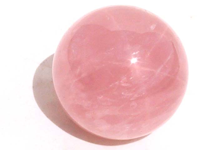
Named "Smokey" to distinguish it from the other proposed Rose Quartz base - I did get permission from the owner of that design to post mine as rose quartz too! Mine is based off of polished rose quartz spheres, and is based heavily on the cracks and color variations one can find! This is a preliminary design, and will be tweaked. I'd like to add in more impurities for color variation - I'm thinking silver/gray, since the other pink bases have gold tones. I absolutely would love if more skilled artists would try their hand at this design too - I watched some amethyst painting tutorials before hand, but I'm still fairly a novice! I'd love to see what other people could come up with using the same concept! I'd also love some feedback - do you think there's too much white? Think I should use a different shade of pink? More or less cracks? Silver tones for the impurities or other colors? REVISION!! To see the old versions, go here and here So a lot of people wanted softer lines! I wasn't quite sure how to achieve that since I'm still a novice but I did my best. I think I'll continue to soften them up as I work on it - this is a color check to see if you guys like the colors better. I got a very nice edit from a user named Isaac that I used to improve the colors, so let me know what you think! Still too salmony? I tried going pinker but kept getting too purpley. Anyway, there's a hard lined version, as a reference, and my attempt at a softer line. I also changed the pattern on the legs a bit. If you guys like this version better I'm going to start trying to add impurities in. The Hard-transition version:  The Soft transition version:  Soft-transition lineless:  I tried going for less white by using a less bright, pale pink instead of a nearly white pink, and by using colors that were closer together. The images I used for reference and that I want the base to look like:     Feedback and tweaks so far, Version 2: If you're going to no support, please tell me why, since this is still in development so I'll probably fix what you don't like! Thank you! |
|
Jack | G2 Jellyfish Prion (#98461) View Forum Posts  Posted on 2019-04-09 16:29:34 |
No support, my apologies. I do love what it's based off of! But the colouring itself on the line... doesn't really match Lioden, I don't think, nor does it match the colour of the original images ;;  0 players like this post! Like? 0 players like this post! Like? |
|
Crow (#39390)
Deathlord of the Jungle View Forum Posts  Posted on 2019-04-09 16:29:35 |
I think it would look significantly better with softer colors. Sharp lines in the coloration don't work. Soften it a little, and I'll rethink my decision not to support.  0 players like this post! Like? 0 players like this post! Like? |
|
🐓 Cas - RoseGold Ferus (#53817) Spicy View Forum Posts  Posted on 2019-04-09 16:30:38 |
I like the idea! I think slightly softer lines and a duller pink (not as salmon, a bit more pale?) would make it look awesome!!  0 players like this post! Like? 0 players like this post! Like? |
|
CurledLight (G1 OSR) (#148865)
Deathlord of the Jungle View Forum Posts  Posted on 2019-04-09 16:32:06 |
Thank you both! So softer colors and lines! Thank you for the feedback, I really appreciate it!  0 players like this post! Like? 0 players like this post! Like? |
|
PeachMilk 🍑 lil Low Rider (#8330) 
View Forum Posts  Posted on 2019-04-09 16:32:14 |
Veni (#121432)

Interstellar View Forum Posts  Posted on 2019-04-09 16:32:31 |
Not going to No support, but I feel that it could be tweaked a bit. The cutoffs for the darker tones feel pretty sharp and abrupt. Some blending would do well, especially on the legs' color transitions. In the examples of the stones you've shown, there are cutoffs, but they're more subtle and ease into each other a bit more easily.  0 players like this post! Like? 0 players like this post! Like?Edited on 09/04/19 @ 16:33:52 by DarkVenom (#121432) |
|
jezily [G3 Subtle Ammonite] (#138794) Sapphic View Forum Posts  Posted on 2019-04-09 16:32:47 |
I definitely support a base like this! I love light pinks and would love more of them - but I do have to agree that the colors look a lil funky. It's more salami-esk than rose quartz, in my opinion, and that's pretty. . . yikes. But I can see what you were going for which is why I'm still supporting. Just make the lines soft and the colors lighter.     0 players like this post! Like? 0 players like this post! Like?Edited on 09/04/19 @ 16:37:21 by ☀️ rosebast 🌵 (#138794) |
🐝 Ginger_Bee 🐝 (#167127)

Angelic View Forum Posts  Posted on 2019-04-09 16:34:54 |
I'll smash support once it's revised and possibly made a much more softer pastel pink and the lines reworked :) it's a nice concept, just needs to be made softer overall and a bit more translucent maybe?  0 players like this post! Like? 0 players like this post! Like? |
|
Mots - RP Loved🏒 (#5378)
Dreamboat of Ladies View Forum Posts  Posted on 2019-04-09 17:29:07 |
I'm not going to say yes or no just yet, like others said I will wait to see any refinements or revisions to this. I love the idea, and I can see where you are going with it. But right now it sort of looks like a model of musculature (if that makes sense). Not trying to be mean or anything, it just looks kind of like how muscles are put together currently. Like others have said, if it was softer and a little more blended I'm sure it would look awesome.  0 players like this post! Like? 0 players like this post! Like? |
|
CurledLight (G1 OSR) (#148865)
Deathlord of the Jungle View Forum Posts  Posted on 2019-04-09 19:06:46 |
I edited it! I'd love to see what you guys think of this version. You can still see the old version by following the links.  0 players like this post! Like? 0 players like this post! Like? |
Veni (#121432)

Interstellar View Forum Posts  Posted on 2019-04-09 19:16:28 |
The soft transition is a great improvement. The transition on the slope going from the shoulder to the underbelly still feels a tad sharp, but I'll go ahead and support.  0 players like this post! Like? 0 players like this post! Like? |
|
CurledLight (G1 OSR) (#148865)
Deathlord of the Jungle View Forum Posts  Posted on 2019-04-09 19:24:41 |
Veni (#121432)

Interstellar View Forum Posts  Posted on 2019-04-09 19:26:21 |
Ah, that's it. Much more fluid and in tune with the rest of the blends.  0 players like this post! Like? 0 players like this post! Like? |
|
GayenaKing [Leonid Project] (#74562) Interstellar View Forum Posts  Posted on 2019-04-10 08:10:15 |
Tbh even just a pink recolor of chatoyant would work, but yes more pink bases  0 players like this post! Like? 0 players like this post! Like? |
|
Arisa (#99230)
View Forum Posts  Posted on 2019-04-10 09:35:53 |
The lines are a little to bold between the darker pink and the silver pink color, some shading for a better transition would look nice. But its a really pretty color and we need more pink bases  0 players like this post! Like? 0 players like this post! Like? |
1 2 |
|---|
Memory Used: 632.58 KB - Queries: 2 - Query Time: 0.00095 - Total Time: 0.00475s
 Report


