|
1 2 |
|
|---|---|
| Posted by | Another Green Base, but better. |
 Roxanne (G1 Ebony) (#125490) 
View Forum Posts  Posted on 2019-08-08 19:41:21 |
 |
 Report


|
Limerick 🕯️ G2 Ebony 6xBO pie (#152372) Angelic View Forum Posts Posted on 2019-08-11 03:44:58 |
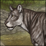
Touche. I pointed out that my wardrobe version is a more saturated than OP's design, but you guys are reasonable for taking note of it. I was trying to demonstrate that, although this base is a nice idea and it's very pretty, its composition (dark overcoat, pale undercoat, eye rings, faint speckles) can be created using existing markings, thus making it a little unnecessary. To get a better look at tones, I made a colour chart comparing OP's base design with my wardrobe mockup: https://sta.sh/02905chji49b In this, I identified a heap of similarities, colour-picked from the same area on each lioness: - The two lions have very similar overtones and undertones, although mine are slightly more saturated. - Although my mid-tone is more saturated than OP's, you'll notice they're... not that different to look at - The two lions have the same general pattern (rings around the eyes, open neck patch, soft paw gradient, overcoat shape and sloping underbelly coat). - My version has a background, whereas OP's is transparent. This might be affecting how the shades of green appear, kind of like those optical illusions where two dots of the same colour/size look different because of their surroundings. Having said that, I also identified two main areas of difference, which I think may be contributing to the difference in shade you guys pointed out. I've labelled them 1 and 2 on my diagram: 1. The highlights, located between the lion's overtones and mid tones. The green base is very vibrant, so in my version, the highlights are much brighter and more saturated. I did acknowledge this earlier. 2. The tail, which I openly admitted I couldn't get right on Wardrobe. Some other minor differences I noticed as I typed this: - OP's design has a dark patch under her eyes, but I couldn't replicate this on Wardrobe. - The Vit 5 marking I used has a different pattern to the speckles on OP's design - I couldn't tell what eye colour OP used, but I used cucumber The only other thing I can think of that might be affecting my perspective is my computer's colour space. I'm using a Macbook Air with the Colour LCD setting, which as far as I know is the default. I loaded the image onto my phone to compare and it didn't look too different.  0 players like this post! Like? 0 players like this post! Like? |
|
yeehaw country man (#122541)
Maneater View Forum Posts Posted on 2019-08-11 19:02:07 |
I LOVE IT! It’s not a complete joke base like Green, and it’s not super desaturated and brownish like Olive and Murk. And while I love all those bases, I really want a true green base in the game—and one that actually passes. 0 players like this post! Like? |
|
🐀 Detective (#19808)
Lone Wanderer View Forum Posts Posted on 2019-10-29 22:54:40 |
too bright/saturated for me. If it got toned down a bit it'd be nice though. 0 players like this post! Like? |

1 2 |
|---|
Memory Used: 632.30 KB - Queries: 2 - Query Time: 0.00040 - Total Time: 0.00468s