|
1 |
|
|---|---|
| Posted by | Jaglion Lineart - Color change + Questions |
 Espenfalls ✧ G1 12/15bo Nomad (#127995) Divine View Forum Posts  Posted on 2024-06-29 20:31:31 |
Disclaimer: This is not intended to hurt, offend, or in any way insult the wonderful artists at Lioden! This posts only intention is to ask questions and provide evidence. Now, I know that changing the lineart is impossible, but I do have one proposal that I ask is considered: Change the lineart color to better match the previous styles. While they will still be different, it will make it so there is at the very least more consistency between all the different works.
|
|
Bluebell [Revival project] (#281374) View Forum Posts  Posted on 2024-06-29 20:47:17 |
I feel if they lower the opacity or thin out the outlines, it would match the existing hybrids better. But there would probably be a fair bit of work involved for correcting bases if there is any bleed after changes. Changing the colour would probably be the easiest option. I feel the male adult has the thickest lines, especially the back/shoulder area, but the cubs stages seem alright to me. I love the line art either way and honestly wouldn't mind if it stayed, but can see if the inconsistencies put people off.  7 players like this post! Like? 7 players like this post! Like?Edited on 29/06/24 @ 20:47:46 by Bluebell [G1 Vagabound] (#281374) |
|
🖤 Reno Sinclair 🖤 (#131377) Blessed View Forum Posts  Posted on 2024-06-29 21:04:50 |
To me the lineart is lovely the way it is! I personally see it as refreshing, new, and exciting!! A different change of pace in looks! Never hurts to branch out and artists also grow with time and more work <3 With that also being said, I do see where you are coming from! <3  2 players like this post! Like? 2 players like this post! Like?Edited on 29/06/24 @ 21:05:37 by 🖤 Reno Sinclair 🖤 (#131377) |
|
surrelian [main | BO Haze] (#103352) 
View Forum Posts  Posted on 2024-06-29 21:11:30 |
personally, it's a no support! it's bit presumptuous to say the lineart doesnt match Lioden style haha, as it was created by artist(s) trained on that style specifically. I think it's important to note that the change in style, while different, just reflects the changing art style over the years. The original pon lines are almost ten years old so they are going to look different from the linework created now with the new colors/thickness. The color change is likely due to limitations that the older colors have. It's a lot harder to create new art with more depth when you are limited to the darkest colors being somewhat lightish-dark browns. The blacker lineart gives the artists more freedom to work. Tbh it makes the lines pop! It's a cleaner look and shows off how the art has improved, but again that might just be me because I dont see why the styles have to match exactly to the other hybrids. This is the style that all lion related decors/encounters have been drawn in over the past two-ish years and they all look good with the older lineart imo And I am positive that this will have zero effects on CD rules. You could probs confirm with mod box, but I really doubt this will have any changes to CD acceptance. The rules are a lot more lax then they used to be and you can already see a variety of styles in accepted works :)  13 players like this post! Like? 13 players like this post! Like? |
|
Bandit Gambit [Project] (#98263) Nightmare View Forum Posts  Posted on 2024-06-30 03:23:05 |
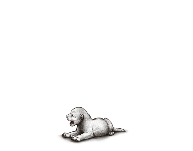
Newborn cub has it the worst lol. Lightening the lineart color to match the rest of them better would feel more consistent, but I don't know how much work that actually is.  4 players like this post! Like? 4 players like this post! Like?Edited on 30/06/24 @ 03:30:24 by Horus Chorus [G1] (#98263) |
|
MorningStar -G1 Wicked Nun (#26098) Punk View Forum Posts  Posted on 2024-08-18 07:43:19 |
I honestly think they should update the older art to have the bolder lines jags had, it would reduce bleedthrough of marks and other issues they have had with the old lineart, and I feel it looks cleaner.  2 players like this post! Like? 2 players like this post! Like? |
|
Xiao Huli (#7742)
Eros View Forum Posts  Posted on 2024-08-31 17:03:28 |
I don't support this. I like the way they did this. It shows growth. It shows a striking difference. I like all three art styles though I do somewhat agree. Other areas are getting updated art, maybe like MorningStar said the leopons and tigons should edited to have the fresh new style. That would take a lot of work yes but might help with some art issues especially with new marks and bases.  0 players like this post! Like? 0 players like this post! Like? |
|
[All mut pride]Barnashunter12 (#226934) Total Chad View Forum Posts  Posted on 2024-09-01 13:49:00 |
I THOUGHT I WAS GOING INSANE WHEN I SAW THE ART FOR THE FIRST TIME AND NO ONE BROUGHT THIS UP!! It is SO THICK..... 100% support, just make it less bulky  0 players like this post! Like? 0 players like this post! Like? |
|
[△] Nadir (#108458)
Prophet View Forum Posts  Posted on 2024-11-02 00:40:05 |
Something they did with lions a long time ago was go back and slightly thicken the line art so it was more uniform. That might help here.  0 players like this post! Like? 0 players like this post! Like? |
1 |
|---|
 Report


