|
1 |
|
|---|---|
| Posted by | Can we talk about Nether? |
 Fraekincense (#57572) View Forum Posts  Posted on 2024-10-25 07:16:43 |
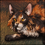
This isn't a critique, this is constructive feedback regarding the inconsistencies with the new Nether base. My friends and I were discussing the new RL, and we focused on the base; Nether. There seem to be some inconsistencies across poses/mutations and I thought it'd be an idea to collate them in a thread as constructive feedback. Lets start with the basic female poses.       Notes: - The head seems much more grey on the Neutral Pose than other poses/mutations, please compare to other poses above. - The hip on kind/neutral seems quite light compared to the other poses like a different shade of black was used. Also noticeable on the tail. - Chest spot/chin spot intensity, on some, it is more solid and on others, it is more blended, it varies quite a bit, especially on the chins in the default female poses. It changes positions also, on Neutral you can barely tell it's there. - The bellies, why do all of the above have dark bellies, but when we move to Nesting/Jolly, the bellies are bright red?    Now we scoot to mutations.  Jaglion's base leaches onto the mane on the wither/shoulder area.  1 player likes this post! Like? 1 player likes this post! Like? Edited on 25/10/24 @ 07:17:17 by Fraekinn [Soul 10x Seal] (#57572) |
|
Fraekincense (#57572)
View Forum Posts  Posted on 2024-10-25 07:19:00 |
Please note the above is not finalised, I'm just tired right now and sleep deprived. I want to reiterate this is just constructive criticism for future bases to be honest, I don't want to catch a ban for pointing this out, and hope I have been polite/respectful enough about it.  0 players like this post! Like? 0 players like this post! Like? |
|
Ricky/Infinightive (#177615)
Deathlord of the Jungle View Forum Posts  Posted on 2024-10-25 07:54:43 |
Things to note that i've noticed: Female default knee and nape are a very dark colour compared to the other bases. Kind pose has a lack of colour due to the blending, which makes it appear duller than the other bases. Jaglion base has crisper, darker colours that work better, and the grey is better blended in [this could be down to the lineart itself, older poses are covered in whiter highlights that may make darker bases appear more greyed] On good and neutral, the chin looks a little unblended because you can see red above the cream colour, which I assume is not meant to be like that considering other bases.  2 players like this post! Like? 2 players like this post! Like?Edited on 25/10/24 @ 07:55:29 by Ricky/Infinightive (#177615) |
1 |
|---|
Memory Used: 627.18 KB - Queries: 2 - Query Time: 0.00036 - Total Time: 0.00398s
 Report
